Introduction
Silkscreen, also known as the legend or markup layer, plays a critical role in PCB manufacturing by providing essential identification markings on the board surface. These markings include component designators, polarity indicators, assembly notes, and version information, all of which facilitate efficient production, testing, and field service. Selecting the appropriate PCB silkscreen fonts ensures these elements remain clear throughout the PCB lifecycle, from fabrication to end-use. Poor font choices can lead to misinterpretation during assembly or inspection, potentially causing delays or errors in high-volume manufacturing environments. This guide explores the principles behind readable PCB fonts, drawing on factory perspectives to help electrical engineers optimize their designs. By prioritizing legibility and manufacturability, engineers can align silkscreen with production capabilities for reliable outcomes.
What Is PCB Silkscreen and Why Do Fonts Matter?
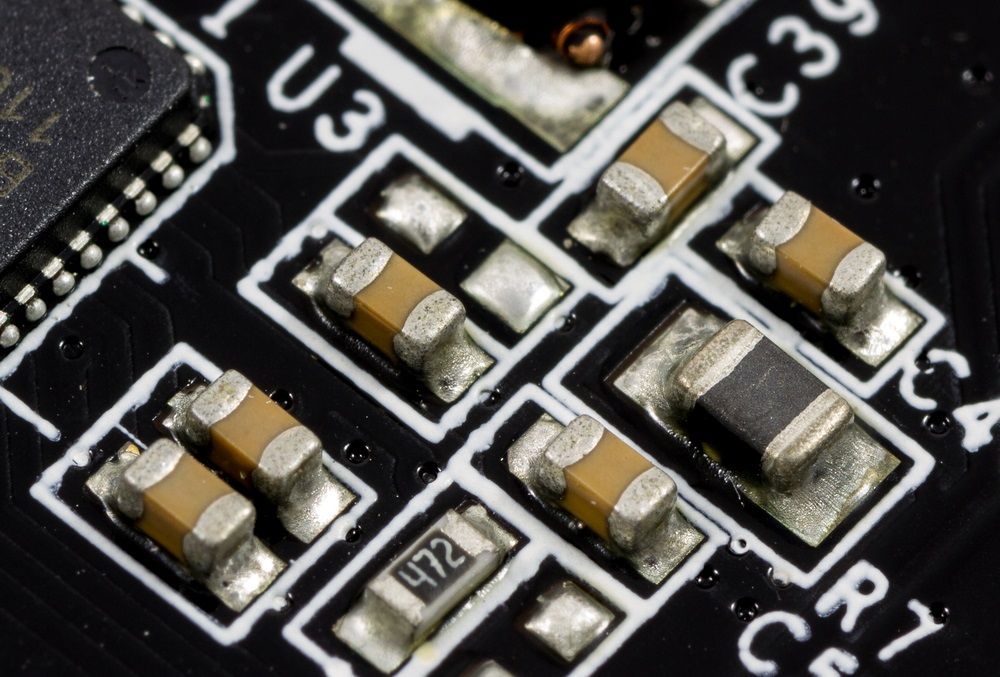
PCB silkscreen refers to the non-conductive ink applied over the solder mask to create visible text and graphics on the board. This layer uses specialized epoxy-based inks cured through UV exposure or thermal processes to withstand soldering temperatures and cleaning solvents. Fonts in silkscreen directly impact the layer's functionality, as they determine how well operators can identify components during hand or automated assembly. In factory settings, silkscreen serves as the primary visual guide when datasheets or software are unavailable, making font clarity essential for reducing rework rates. Factors like ink viscosity, screen mesh resolution, and board warpage influence final print quality, underscoring the need for robust typeface selection.
The relevance of best fonts for PCB silkscreen extends to quality control and compliance. Illegible markings complicate visual inspections and automated optical character recognition (OCR) systems used in modern fabs. From a manufacturing viewpoint, fonts that resist bleeding or fading during reflow soldering maintain traceability, which is vital for high-reliability applications. Engineers often overlook how environmental stresses, such as humidity during storage or thermal cycling, degrade thin or complex fonts over time. Prioritizing durable, simple typefaces aligns silkscreen with production realities, ensuring boards meet end-user expectations without additional processing steps.
Technical Principles of Silkscreen Fonts in PCB Manufacturing
Silkscreen printing relies on vector-based stroke fonts rather than filled outlines, as these convert cleanly to Gerber data for screen preparation. Stroke fonts consist of continuous lines defining character edges, allowing precise control over line width to match printer resolution limits, typically in the range of fine meshes. Complex fonts with fine details or serifs can cause ink bridging or pinholes during stencil transfer, especially on uneven surfaces from copper topography. Factory experience shows that uniform stroke widths prevent these defects, promoting even ink deposition across the board.
Legibility hinges on the aspect ratio of characters, where height significantly exceeds width for optimal recognition at a glance. Sans-serif designs excel here, lacking decorative flourishes that obscure edges under magnification or at distance. Thermal expansion during solder reflow can distort narrow strokes, making bold, proportional fonts preferable for maintaining shape integrity. Ink adhesion also varies with font geometry; open structures reduce trapped air bubbles during curing. These principles guide typeface selection to balance density with clarity on space-constrained boards.
IPC-A-600 provides acceptability criteria for silkscreen markings, requiring legibility without aids for dedicated service products in Class 2 and high-reliability assemblies in Class 3. This standard emphasizes no defects like smudging or double imaging that impair readability, influencing font choices in production. Factories inspect against these visual targets post-printing to verify compliance before further processing.
Key Factors Influencing Readable PCB Fonts
Several manufacturing factors dictate effective PCB silkscreen fonts. Stroke width must suit the printing method, whether traditional screen printing or emerging direct legend printing, to avoid under- or over-inking. Factories calibrate equipment for consistent aperture sizes, so fonts with variable line thicknesses demand adjustments that slow throughput. Character spacing and kerning prevent merging during ink flow, particularly on green solder masks where contrast is moderate.
Font size for silkscreen emerges as a primary consideration, scaled to board real estate while ensuring visibility from typical inspection distances. Undersized text risks rejection under IPC guidelines, while oversized clutter limits component placement. Orientation uniformity aids assembly lines, as rotated text confuses pick-and-place vision systems. Color contrast against the solder mask further enhances perception, with white or black inks standard for broad compatibility.
Environmental durability tests font resilience; inks formulated per industry norms resist yellowing or cracking after multiple reflow cycles. Factories recommend testing prototypes to validate font performance under actual process conditions.
Best Practices for Choosing PCB Silkscreen Fonts
Opt for simple sans-serif or monospaced stroke fonts optimized for vector rendering in PCB design software. These typefaces render crisply at small scales, minimizing artifacts in Gerber output. Avoid decorative or script styles, as they introduce thin elements prone to breakage during printing. In production, such fonts yield higher first-pass yields by aligning with standard screen emulsions.
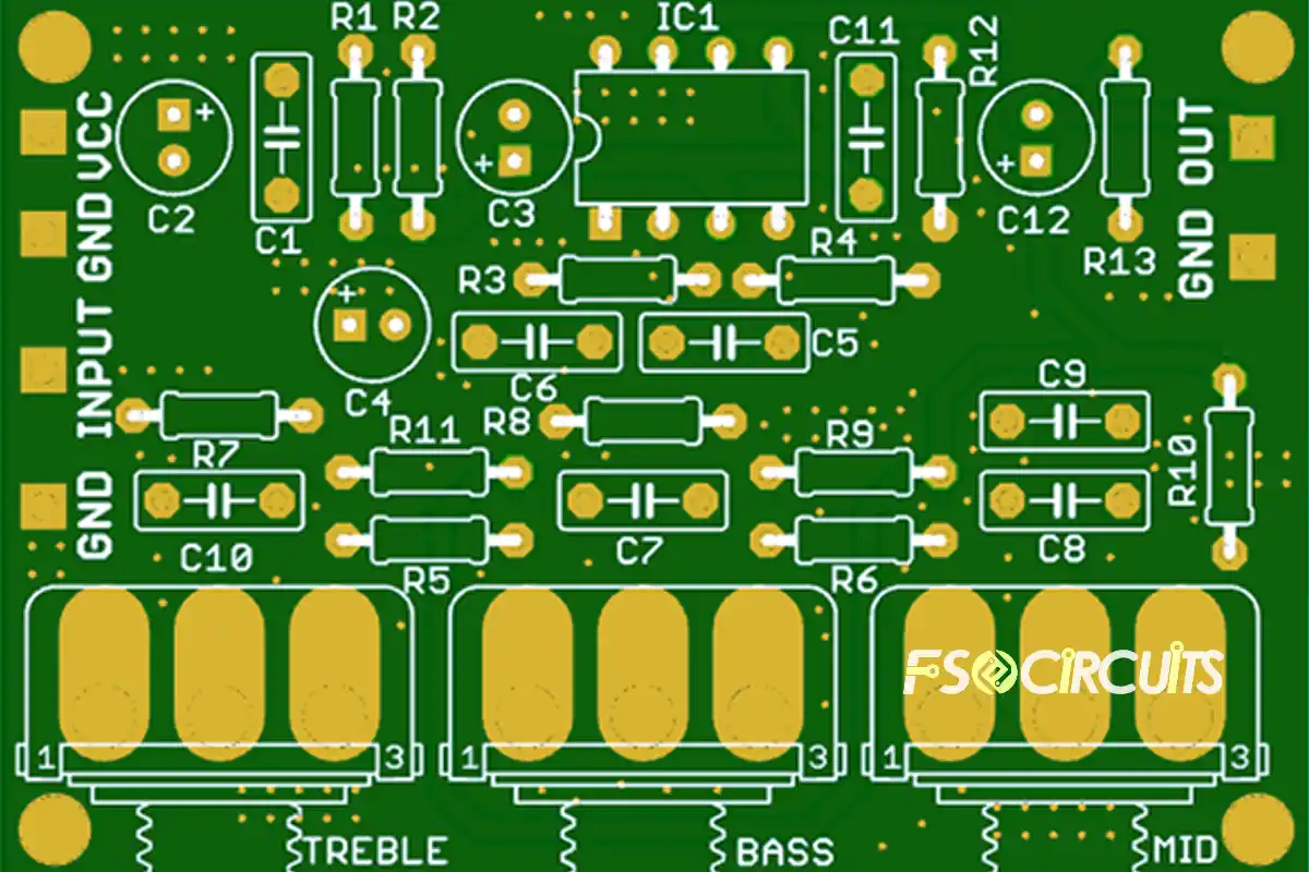
Establish a PCB lettering guide early in design: prioritize reference designators near components, polarity symbols on passives, and board identifiers in corners. Maintain consistent stroke proportions across all text for uniform appearance post-cure. Consult fabricator DFM feedback to refine sizes, ensuring compatibility with their resolution capabilities. Group related markings to streamline inspection flows.
Silkscreen font standards emphasize practicality over aesthetics. IPC-7351 outlines requirements for component-related silkscreen, such as pin-1 indicators, reinforcing placement and style consistency. Factories apply these in footprint libraries to standardize markings globally.
Position text with adequate clearance from pads, vias, and edges to prevent solder mask encroachment or mechanical damage. Horizontal alignment dominates for readability, with vertical reserved for tight spaces. Prototype runs validate choices, allowing tweaks before full-scale manufacturing.
Troubleshooting Common Silkscreen Font Issues
Factories encounter illegible silkscreen from overly thin strokes, resolved by increasing line width uniformly. Bleeding occurs with high-viscosity inks on humid days; switching to low-tack emulsions or preconditioning boards mitigates this. Fading post-reflow signals incompatible inks, addressed by specifying high-temperature formulations.
Distorted characters from board warpage demand flatter substrates or tension-controlled printing. OCR failures in assembly trace to inconsistent spacing; enforcing fixed-width fonts corrects this. Regular equipment maintenance ensures aperture fidelity, preserving font integrity across panels.
Conclusion
Mastering PCB silkscreen fonts elevates board manufacturability and usability for electrical engineers. By selecting readable PCB fonts grounded in factory insights, designs achieve legibility under IPC scrutiny while streamlining production. Focus on stroke-based sans-serif typefaces, proportional sizing, and strategic placement to future-proof assemblies. Integrating these practices reduces defects, accelerates throughput, and supports scalable manufacturing. Ultimately, thoughtful silkscreen elevates PCB quality from functional to exceptional.
FAQs
Q1: What are the best fonts for PCB silkscreen?
A1: Simple sans-serif or monospaced stroke fonts rank as the best fonts for PCB silkscreen due to their clean vector conversion and resistance to printing defects. These typefaces maintain clarity at reduced sizes, ideal for dense layouts. Factories favor them for consistent ink transfer and high inspection pass rates. Avoid serif or ornate styles, which blur under thermal stress.
Q2: What is the ideal font size for silkscreen on PCBs?
A2: Font size for silkscreen depends on board density and readability needs, with larger proportions preferred for critical markings. Industry practices scale heights to ensure visibility without magnification, balancing space constraints. Consult DFM for process-specific limits to align with silkscreen font standards. Prototyping confirms optimal sizing pre-production.
Q3: How do silkscreen font standards impact PCB manufacturing?
A3: Silkscreen font standards like those in IPC-A-600 mandate legible markings for product classes, directly affecting factory acceptance. Compliant fonts reduce rework by enabling clear assembly and testing. They standardize legibility across suppliers, minimizing variability. Engineers benefit from faster yields and reliable traceability.
Q4: What makes a PCB lettering guide essential?
A4: A PCB lettering guide standardizes font selection, placement, and orientation for repeatable results. It prevents common pitfalls like overlapping text or poor contrast, streamlining fab processes. Tailored to class requirements, it ensures markings survive manufacturing stresses. This approach boosts efficiency in high-volume runs.
References
IPC-A-600K — Acceptability of Printed Boards. IPC, 2020
IPC-7351D — Generic Requirements for Surface Mount Design and Land Pattern Standard. IPC, 2010
IPC-6012E — Qualification and Performance Specification for Rigid Printed Boards. IPC, 2015