Introduction
In DIY PCB projects, silkscreen serves as the visual roadmap for your board, labeling components, polarity, and key features. Selecting the right fonts ensures these markings remain clear through manufacturing and use, making assembly and troubleshooting straightforward. Poor typography can lead to confusion during soldering or testing, turning a promising prototype into a frustrating puzzle. For electronic hobbyists, mastering PCB font best practices elevates your designs from functional to professional. This guide explores readable fonts for PCBs, offering a silkscreen font size guide and tips for choosing fonts for etching. By focusing on DIY electronics typography, you can create boards that impress and perform reliably. This guide explores readable fonts for PCBs, offering a silkscreen font size guide.
What Is Silkscreen and Why It Matters in DIY Projects
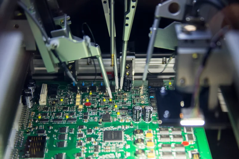
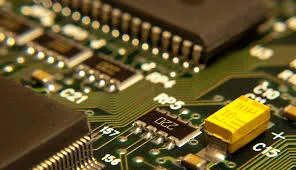
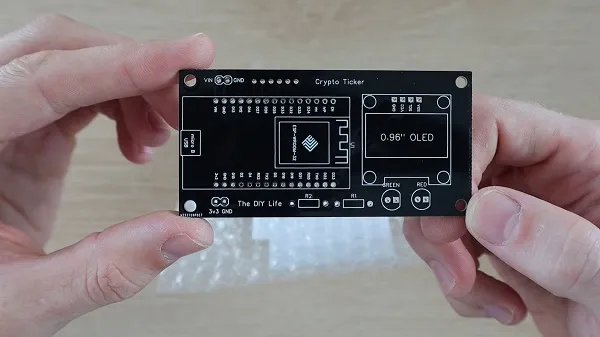
Silkscreen, also known as the solder mask legend or top overlay, is the layer of printed ink applied to the non-conductive surfaces of a PCB. It provides essential information like reference designators, part numbers, logos, and warnings without interfering with electrical traces. In DIY electronics, where you might etch boards at home or order from a fabricator, silkscreen turns a bare copper clad into an identifiable circuit. Readability directly impacts how easily you or others can populate and debug the board.
The importance of silkscreen typography cannot be overstated for hobbyists. Clear fonts prevent assembly errors, such as mistaking a resistor for a capacitor due to blurry labels. They also enhance the board's aesthetics, making your projects shareable in maker communities. During long-term use, durable markings withstand handling, cleaning, and environmental exposure. Following PCB font best practices ensures your designs meet basic industry expectations, even in home setups.
Technical Principles Behind Silkscreen Typography
Silkscreen ink is typically applied via screen printing, where a stencil transfers epoxy-based or UV-curable material onto the board. This process introduces challenges like ink bleeding, where thin lines spread, distorting fine details. Fonts must account for this manufacturing tolerance to maintain legibility after curing and reflow soldering. The interaction between ink viscosity, screen mesh density, and board surface texture influences final appearance.
Key engineering factors include stroke width relative to character height, which affects resolution during printing. Sans-serif fonts perform better because they lack small extensions that blur easily. Serif styles, with their decorative flourishes, often lose definition in the silkscreen process. Consistent line thickness prevents voids or fills that obscure letters. As outlined in IPC-A-600, acceptability criteria emphasize clear, legible markings across the board's life cycle.
Contrast plays a crucial role, as silkscreen ink must stand out against the solder mask color, usually green. White or yellow inks provide high visibility, but their opacity varies with thickness. For DIY etching, where you might use laser-printed transparencies or hand-painting, font geometry must survive chemical exposure and heat. These principles guide choosing fonts for etching, ensuring marks etch cleanly without undercutting.
Silkscreen Font Size Guide for Hobbyists
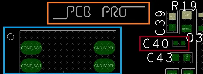
A practical silkscreen font size guide starts with balancing space constraints and readability needs. Smaller boards demand compact labels, but pushing limits risks illegibility post-fabrication. Aim for proportions where character height allows easy recognition from a typical working distance, like 12 inches during assembly. Stroke width should scale proportionally to avoid fragile lines that crack or fill in.
For reference designators near components, prioritize heights that fit without overlapping pads or vias. Logos or version numbers can use slightly bolder styles for emphasis. Test renders in your design software simulate printing outcomes, helping refine sizes iteratively. In DIY projects, larger fonts forgive manufacturing variances better than minimal ones.
Common pitfalls include overcrowding, where tight spacing causes merging of characters. Maintain clearances around text to prevent ink bridging. Orientation matters too; horizontal reading flows aid quick scanning. This guide aligns with PCB font best practices, promoting designs that scale from prototypes to production.
Choosing Fonts for Etching and Manufacturing
When choosing fonts for etching in DIY setups, opt for simple, geometric shapes that translate well from design to physical board. Vector-based stroke fonts, common in PCB editors, generate clean outlines ideal for screen processes. TrueType fonts like basic sans-serifs convert reliably if outlined properly, avoiding raster artifacts. Complex scripts or italics introduce curves that distort under ink pressure.
For home etching, where silkscreen might involve resist pens or photoresist exposure, bold strokes resist etchant better. Monospaced fonts ensure uniform spacing, useful for grids of labels. Avoid filled solids; outlined letters with consistent thickness etch predictably. Preview at fabrication resolution to catch issues early.
Industry insights from IPC-6012 highlight performance specs for markings, stressing durability through assembly stresses. These standards underscore why readable fonts for PCBs extend board usability. In hobbyist workflows, font selection influences rework ease, as clear IDs speed component swaps.
PCB Font Best Practices for DIY Electronics Typography
Implement these PCB font best practices to streamline your projects. First, standardize a font library: select 2-3 versatile sans-serif options for consistency across designs. Use the thinnest viable stroke for elegance without fragility. Position text away from edges, high-heat zones, or flex areas to preserve integrity.
Layer management keeps silkscreen separate from copper and mask, preventing alignment shifts. For multi-layer boards, mirror text on bottom silkscreen if needed. Polarity symbols demand bold, unambiguous fonts, like triangles with bars. Test boards under magnification and lighting variations to validate choices.
Incorporate version control and date codes with compact typography. Group related labels logically, using hierarchy through size variation. These PCB silkscreen best practices, rooted in logical design flow, reduce errors in DIY electronics typography.
Common Troubleshooting for Silkscreen Issues
Hobbyists often face faded or smeared silkscreen after reflow. This stems from ink incompatibility with soldering temperatures or thin application.
Solution: Verify fabricator specs or use heat-resistant DIY paints. Blurry text usually indicates insufficient stroke width; thicken lines in redesign.
Overlapping silkscreen on pads blocks soldering; enforce design rule checks. Faint legends on dark masks need brighter inks. For etching mishaps, like pitted characters, refine exposure times.
Case in point: A hobbyist audio amp board with tiny fonts led to hours of tracing; upsizing resolved it instantly.
Iterative prototyping uncovers these silkscreen design mistakes early. Document fixes in your workflow for future boards. Adhering to J-STD-020 guidelines for handling sensitivities indirectly supports marking durability.
Conclusion
Choosing the right typography transforms DIY PCB projects into reliable, user-friendly creations. Prioritize readable fonts for PCBs through simple styles, proportional sizing, and strategic placement. The silkscreen font size guide and etching tips equip you for success across scales. Embrace PCB font best practices to minimize headaches and maximize satisfaction. With these insights, your electronic hobbyist endeavors will shine with professional clarity. Experiment confidently, knowing solid foundations ensure lasting results. 
FAQs
Q1: What are the best readable fonts for PCBs in DIY projects?
A1: Sans-serif fonts like basic vector strokes or simple outlined styles excel for readability. They resist blurring during silkscreen printing and etching. Maintain stroke widths proportional to height for crisp results. These choices align with PCB font best practices, ensuring labels remain clear post-assembly.
Q2: How do I follow a silkscreen font size guide for small boards?
A2: Scale fonts to fit available space while prioritizing legibility from working distance. Use software previews to simulate fabrication. Avoid extremes; balance compactness with boldness. This approach supports DIY electronics typography without sacrificing usability.
Q3: What to consider when choosing fonts for etching?
A3: Select geometric, outlined fonts that withstand etchant and heat. Test conversions from design to photoresist. Ensure uniform thickness to prevent undercutting. These steps make choosing fonts for etching straightforward for hobbyists.
Q4: Why follow PCB font best practices in hobby projects?
A4: They prevent assembly errors, enhance troubleshooting, and give a polished look. Clear markings speed population and debugging. Standards like IPC-A-600 reinforce legibility needs. Investing here pays off in reliable prototypes.
References
IPC-A-600K — Acceptability of Printed Boards. IPC, 2020
IPC-6012E — Qualification and Performance Specification for Rigid Printed Boards. IPC, 2017
J-STD-020E — Moisture/Reflow Sensitivity Classification. JEDEC, 2014