Introduction
In high-density PCBs, where components pack tightly and trace widths shrink, silkscreen markings play a critical role in ensuring assembly accuracy and long-term reliability. Silkscreen color high-density PCB design demands careful selection to maintain readability amid space constraints. Engineers face unique challenges when choosing silkscreen color for small PCBs, as poor contrast can lead to misinterpretation during inspection or rework. This article explores how to optimize silkscreen colors for clarity, drawing on factory insights and industry standards. By prioritizing contrast and legibility, designers can enhance functionality without compromising board density. Maximizing readability silkscreen color becomes essential in applications like consumer electronics and telecommunications.
Understanding Silkscreen and Its Importance in High-Density PCBs
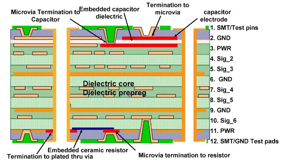
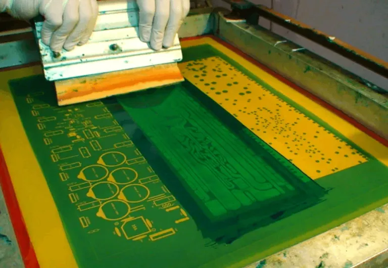
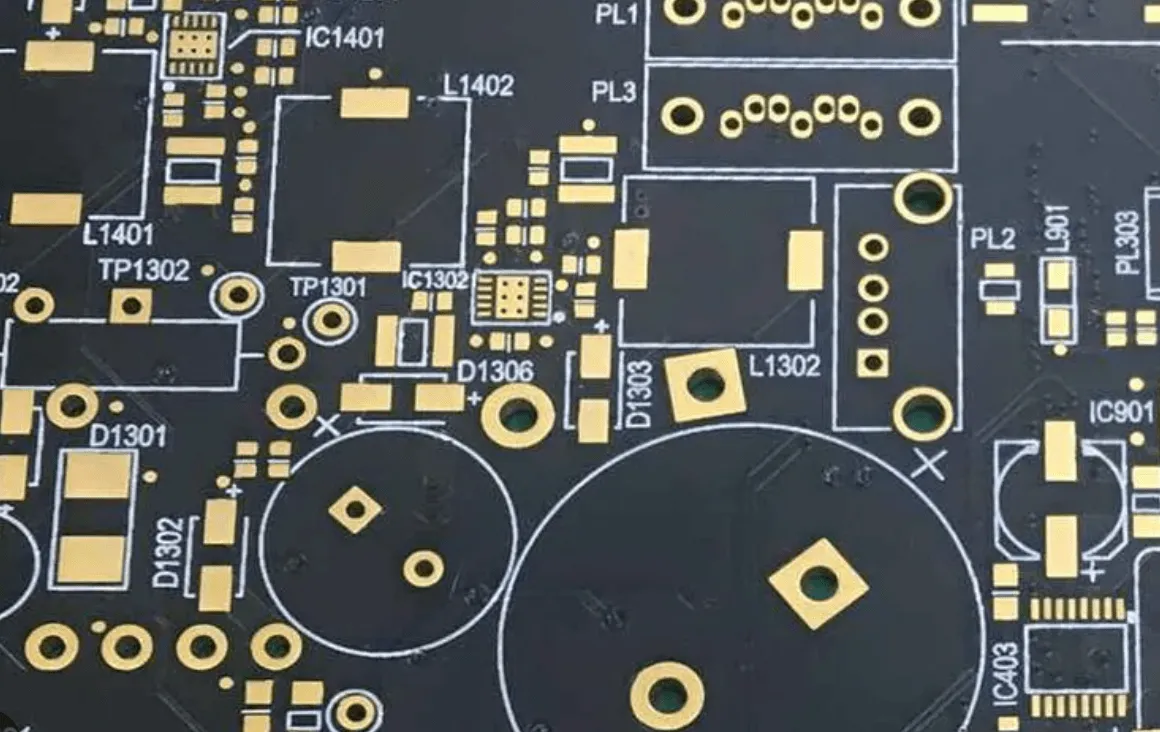
Silkscreen, also known as the legend layer, consists of printed inks applied to the PCB surface to denote component outlines, polarity indicators, reference designators, and fabrication details. In high-density interconnect (HDI) boards, these markings guide automated optical inspection (AOI) and manual assembly, reducing errors in densely populated areas. Factory processes typically apply silkscreen after solder mask, using epoxy-based inks cured for durability. The choice of silkscreen color directly impacts visibility against the underlying solder mask, which often dominates the board's appearance. Without proper optimization, faded or low-contrast legends can complicate troubleshooting in field repairs. Standards like IPC-A-600 emphasize the need for markings that remain legible under various lighting conditions.
High-density PCBs amplify these requirements due to finer pitches and microvia integration, leaving minimal real estate for text. Engineers must balance informational density with print resolution limits during manufacturing. Silkscreen serves not only aesthetic purposes but also functional ones, such as aiding in thermal pad identification or test point location. In production, misalignment between silkscreen and copper features can occur if artwork tolerances are not tightly controlled. Thus, silkscreen color space constraints demand proactive design strategies from the outset.
Challenges of Silkscreen Color in Space-Constrained Environments
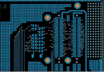
High-density and small PCBs present silkscreen color space constraints that challenge traditional marking approaches. Component footprints like BGAs and QFNs occupy vast surface areas, forcing legends into narrow corridors between pads. Overlapping silkscreen with solder mask openings risks ink bleed, compromising solderability and inspection clarity. Darker solder masks exacerbate visibility issues if mismatched colors are selected, leading to assembly delays. Factory experience shows that in tight spaces, low-contrast combinations increase reject rates during final visual checks.
Choosing silkscreen color tight spaces requires accounting for ink thickness and curing effects, which can alter perceived sharpness. Vibrant hues may fade post-reflow, while matte finishes hold better under handling. High-density boards often incorporate multiple layers, limiting silkscreen to top and bottom sides only. This restriction heightens the need for precise high-density PCB silkscreen placement to avoid obscuring fiducials or edge connectors. Engineers report frequent trade-offs between detail level and manufacturability in such designs.
Principles of Silkscreen Color Selection for Maximum Contrast
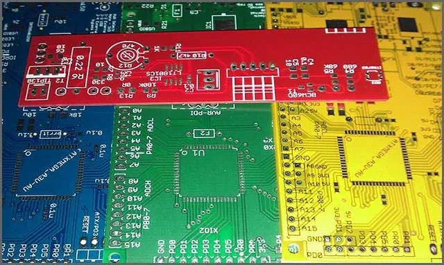
Effective silkscreen color selection hinges on achieving high contrast against the solder mask, the primary visual backdrop. White ink excels on green or black masks, providing sharp edges for reference designators even in dim lighting. Black performs reliably on lighter masks like white or yellow, minimizing glare during close-up inspections. Yellow offers versatility for warning symbols but demands testing for bleed resistance in dense areas. Factory-driven insights reveal that non-standard colors increase setup times, so standard pairings streamline production.
Contrast ratios influence readability across distances, critical for operators scanning multiple boards. In silkscreen color high-density PCB applications, engineers simulate final appearance using 3D renders to predict outcomes. Solder mask texture affects ink adhesion; smoother finishes yield crisper prints. Avoiding metallic or fluorescent inks prevents reflection issues under AOI lights. IPC-2221A outlines minimum legibility criteria, ensuring markings withstand environmental stresses.
Best Practices for Maximizing Readability in Tight Spaces
To address silkscreen color space constraints, prioritize essential markings like polarity and critical nets, using abbreviations where possible. Sans-serif fonts with uniform stroke widths enhance print fidelity on small PCBs. Maintain clearances from pads per design rules to prevent solder wicking into legends. Orient text horizontally for consistent readability, rotating only when unavoidable. Factory protocols recommend vector-based artwork for sharper edges at reduced scales.
Line widths and character heights must meet IPC-2221A guidelines, such as minimum 1.5 mm height and 0.3 mm stroke, adapted for class levels. In high-density zones, stack identifiers vertically or use icons for space savings. Validate designs with DFM analysis to flag potential overlaps. Multi-color silkscreen, though rare, suits layered info but raises costs. Regular pilot runs confirm color stability post-bake.
Test legend durability through abrasion and solvent exposure simulations. Pair colors with matte solder masks to reduce specular highlights. Document choices in fab notes for consistent replication across revisions. Learn our guide on silkscreen color best practices.
Troubleshooting Common Silkscreen Issues in High-Density Designs
Poor silkscreen adhesion often stems from contaminated surfaces or incompatible inks, manifesting as peeling in humid environments. Low contrast appears after reflow if flux residues alter hues; cleaning steps mitigate this. Blurry prints result from excessive ink viscosity or screen tension errors in production. Engineers troubleshoot by reviewing artwork scaling and panelization. IPC-6012E performance specs guide qualification tests for external finishes, including legends.
In small PCBs, overcrowding leads to merged characters; depopulate non-essentials strategically. Color shifts from curing ovens require low-temp inks for sensitive stacks. Field failures trace back to unreadable marks under vibration; reinforced inks help. Case insights from dense telecom boards show 20% yield gains from contrast audits. Iterative prototyping refines choices effectively.
Conclusion
Optimizing silkscreen color high-density PCB designs ensures clarity amid escalating densities. Key strategies include high-contrast pairings, adherence to legibility standards, and minimalist placement. Engineers benefit from factory-aligned practices to navigate silkscreen color for small PCBs effectively. Maximizing readability silkscreen color and managing space constraints yield reliable assemblies. Prioritizing these elements supports scalable production and robust performance.
FAQs
Q1: What is the best silkscreen color high-density PCB for readability?
A1: White on green or black solder masks provides superior contrast for silkscreen color high-density PCB applications. Black suits light masks to avoid glare. Factory tests confirm these pairings maintain legibility post-assembly. Always verify against your specific mask color during design review.
Q2: How do you choose silkscreen color for small PCBs under space constraints?
A2: Prioritize high-contrast options like white or yellow, ensuring clearances from pads. Use IPC-2221A minimum sizes for legibility despite silkscreen color space constraints. Simplify text and test prints for sharpness. This approach balances density with usability in compact designs.
Q3: What practices maximize readability silkscreen color in tight spaces?
A3: Select fonts with consistent strokes and orient horizontally where possible. Maintain contrast with solder mask and validate via prototypes. Standards like IPC-A-600 guide acceptability checks. These steps enhance visibility for assembly and inspection in constrained areas.
Q4: Why is contrast critical when choosing silkscreen color tight spaces?
A4: Contrast ensures quick identification of components amid dense layouts. Mismatched colors lead to errors in AOI or manual work. Factory insights stress pairings like black on white for optimal results under silkscreen color space constraints. Durability testing confirms long-term clarity.
References
IPC-A-600K — Acceptability of Printed Boards. IPC, 2020
IPC-2221A — Generic Standard on Printed Board Design. IPC, 2003
IPC-6012E — Qualification and Performance Specification for Rigid Printed Boards. IPC, 2017