Introduction
As an electronic hobbyist, you know the thrill of bringing a circuit to life on a custom PCB. One key element that elevates your project from functional to professional is the silkscreen layer. This guide serves as your PCB silkscreen color guide, helping beginners grasp the basics of silkscreen color and why it matters for clear labeling. Whether you are prototyping a sensor board or assembling a microcontroller setup, choosing the right silkscreen color ensures readability during assembly and troubleshooting. We will cover understanding silkscreen color options, a step-by-step silkscreen color tutorial, and practical tips to get started with silkscreen color confidently. By the end, you will design PCBs that look sharp and perform reliably.
What Is PCB Silkscreen and Why Does Color Matter?
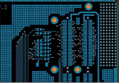
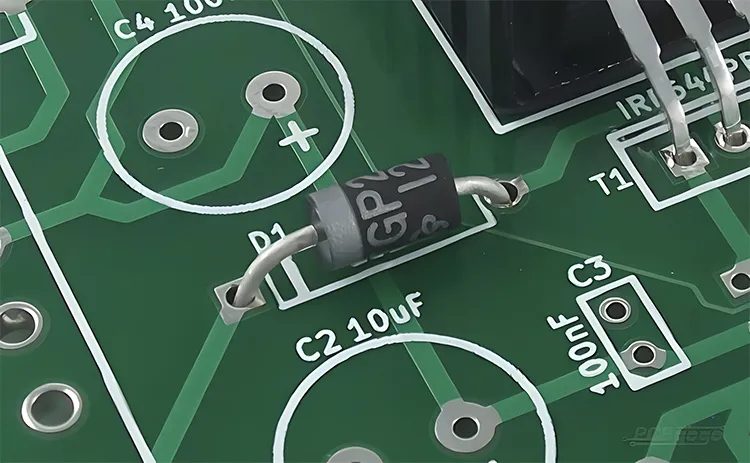
PCB silkscreen, also known as the legend layer, is a non-conductive ink printed on the board's surface to add text, symbols, logos, and component outlines. It appears on the top or bottom side, overlaying the solder mask, and helps identify parts like resistors or ICs during soldering and testing. For hobbyists, good silkscreen makes debugging easier, especially on crowded boards. Color plays a crucial role because it affects visibility under different lighting conditions and against the solder mask background. Poor color choice can lead to faded or hard-to-read markings, frustrating your build process. In short, silkscreen color turns a bare board into a labeled roadmap for your electronics project.
The relevance of silkscreen color extends to reliability in hobby applications. High-contrast colors prevent errors when populating components by hand. They also aid in inventory tracking for multiple prototypes. Industry standards like IPC-A-600 emphasize legibility requirements for markings, ensuring they withstand handling and environmental exposure. For beginners, prioritizing color contrast simplifies the transition from breadboard to soldered PCB. This foundation supports more complex designs as your skills grow.
Understanding Silkscreen Color Options
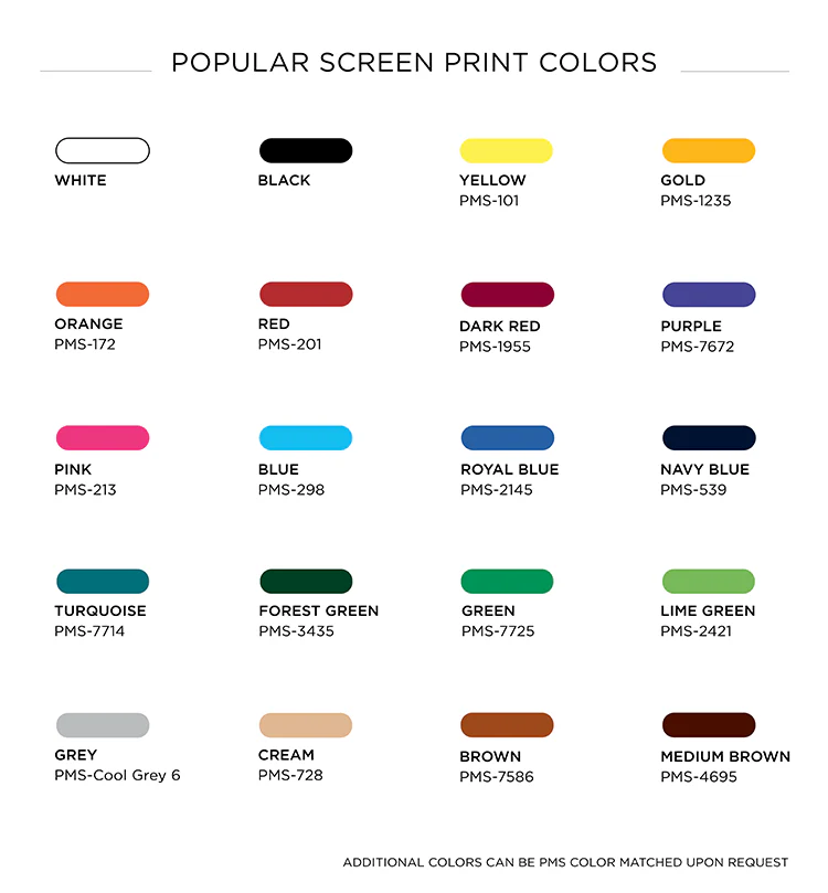
Silkscreen inks come in several standard colors, each suited to specific solder mask backgrounds. White remains the most common choice, offering excellent contrast on dark solder masks like green, blue, or black. It provides sharp, durable markings visible from a distance, ideal for hobby benches. Black works well on lighter masks such as white or yellow, creating bold outlines for logos or warnings. Yellow delivers good visibility on green or blue boards, adding a vibrant touch without overpowering the design.
Other options include red, blue, and green, though availability varies. Red stands out on white or light masks but may blend on darker ones. Blue offers subtlety on green solder masks, useful for aesthetic projects. Green silkscreen pairs with contrasting masks like white for themed builds. Always verify manufacturer capabilities, as not all colors support fine details equally. Selecting from these ensures your PCB looks professional while meeting practical needs.
Factors influencing color choice go beyond aesthetics. Contrast ratio determines readability, with light-on-dark or dark-on-light performing best. Durability matters for exposed boards; UV-cured inks in standard colors resist fading. Cost stays low for common options like white or black. For hobbyists, test contrast by printing a sample Gerber viewer image on paper over a mock solder mask color. This simple check aligns your vision with the final product. Common choices include white, black, yellow, and red — see our complete PCB silkscreen color options guide for detailed pairings.
Technical Principles Behind Silkscreen Colors
Silkscreen application involves screen printing or direct legend printing with epoxy or UV-curable inks. The ink bonds to the solder mask after curing, forming raised or flat markings. Color pigments mix into the base ink, affecting opacity and reflectivity. White ink uses titanium dioxide for brightness, ensuring high legibility under IPC-A-600 guidelines for minimum character height and stroke width. These standards define acceptable conditions, preventing defects like pinholes or bleeding.
Contrast relies on optical properties: light colors reflect more light, standing out on matte dark surfaces. Solder mask texture influences this; glossy masks may reduce readability compared to matte. Ink thickness, typically 10-25 microns, impacts durability against solvents or abrasion. Qualification under IPC-4781 tests inks for adhesion, color fastness, and resistance to reflow soldering. Hobbyists benefit by specifying standard thicknesses for consistent results. Understanding these principles helps avoid common pitfalls in your designs.
Environmental factors play a role too. Indoor hobby projects tolerate most colors, but sunlight-exposed boards need fade-resistant inks. Thermal expansion during soldering must not crack the legend, as per IPC-6012 performance specs. Color choice indirectly supports automated optical inspection if scaling up. For beginners, sticking to proven combinations simplifies fabrication files.
Step-by-Step Silkscreen Color Tutorial for Beginners
Getting started with silkscreen color follows a straightforward process in your PCB design software. First, select your solder mask color, as it dictates silkscreen pairing; green mask pairs ideally with white silkscreen. Open the silkscreen layer in your editor and draw text or shapes using vector fonts for crisp output. Set stroke widths to at least 0.15mm (6 mils) and heights over 1mm for readability, aligning with industry legibility norms.
Next, choose the color in the layer properties; preview contrast against the solder mask layer. Avoid overlapping pads or vias, as silkscreen auto-clears from them during manufacturing. Generate Gerbers and review in a viewer, zooming to check fine details. Export fabrication notes specifying the color, like 'White silkscreen on top, none on bottom.' Submit files and request a DFM review if offered.
Test your first run on a small prototype. Assemble under workshop lights to verify visibility. Adjust for future boards based on feedback, such as switching to yellow for better pop. This step-by-step silkscreen color tutorial builds confidence for iterative designs. Track changes in your project log for efficiency.
Best Practices for Silkscreen Color Selection
Prioritize contrast as the top best practice; use white on green for universal readability. Limit silkscreen to essential info: component values, polarities, and board version. Space markings 0.1mm from traces or edges to prevent shorts. Use sans-serif fonts like Arial for clean printing at small sizes. Matte inks reduce glare in bright environments. For high-density boards, follow the tips in our Silk Screen Color and High-Density PCBs guide.
Position legends away from high-heat areas like power traces to avoid discoloration. For double-sided boards, match colors top and bottom unless functional needs differ. Document choices in schematics for team projects. These habits ensure compliance with standards like IPC-A-600 without extra effort. Hobbyists save time by standardizing on two colors across projects.
Consider application specifics. For LED backlit boards, translucent silkscreen enhances glow. Dense boards benefit from hierarchical labeling: large refs for ICs, small for passives. Always simulate aging by exposing samples to light. These practices elevate your PCBs from hobby to pro-level.
Common Troubleshooting for Silkscreen Issues
Faded silkscreen often stems from low-contrast pairs or thin inks; switch to bolder colors like black on light masks. Blurry text results from strokes under 6 mils; thicken and reprint. Ink bleed happens on glossy masks; opt for matte or adjust clearance. If colors shift post-reflow, confirm IPC-4781 qualified inks were used.
Assembly errors trace to unclear polarities; enlarge diodes symbols. For multi-layer boards, verify layer registration in Gerbers. Test fixes on panels before full runs. These solutions keep your hobby projects on track.
Conclusion
Mastering silkscreen color transforms your PCBs into clear, professional builds. From basics of silkscreen color to advanced options, focus on contrast and standards for success. Follow this PCB silkscreen color guide to select white for green masks or alternatives as needed. Implement the step-by-step silkscreen color tutorial for flawless results every time. As a hobbyist, these insights streamline prototyping and inspire creativity. Start applying them to your next project today. Learn how silkscreen color technology will evolve in our article on The Future of Silk Screen Color Technology in PCB Manufacturing.
FAQs
Q1: What is the best silkscreen color for a green solder mask PCB?
A1: White silkscreen provides the highest contrast on green solder masks, making labels easy to read during assembly. This combination follows common practices for legibility under IPC-A-600. For hobbyists, it suits most indoor projects without added cost. Avoid matching colors like green to prevent invisibility.
Q2: How do I choose silkscreen colors in PCB design software?
A2: In the silkscreen layer settings, select from options like white, black, or yellow, then preview against the solder mask. Ensure stroke widths exceed 0.15mm for sharp printing. This basics of silkscreen color approach confirms understanding silkscreen color options before fabrication. Export notes specifying the choice clearly.
Q3: Can silkscreen color affect PCB assembly?
A3: Yes, poor contrast leads to misplacement of components, especially tiny SMD parts. High-visibility colors like white speed up hand-soldering for beginners. Understanding silkscreen color options ensures smooth workflows. Test under your lighting for real-world validation.
Q4: What standards guide silkscreen color and legibility?
A4: IPC-A-600 and IPC-4781 define marking acceptability, ink durability, and minimum sizes. They emphasize contrast for reliable identification. Hobbyists benefit by aligning designs to these for quality boards. No need for custom specs with standard colors.
References
IPC-A-600K — Acceptability of Printed Boards. IPC, 2020
IPC-4781 — Qualification and Performance Specification for Printed Electronics Inks. IPC, 2019
IPC-6012E — Qualification and Performance Specification for Rigid Printed Boards. IPC, 2017