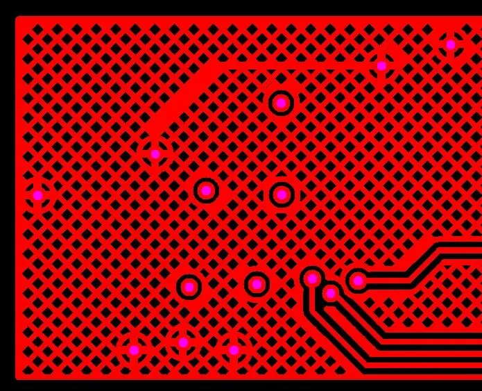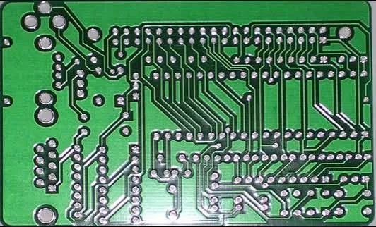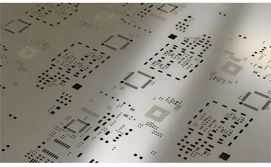







FPC silkscreen blurry issues show up more often than they should. The legend ends up smeared, characters merge together, or fine text becomes completely unreadable after fabrication. This usually traces back to designers treating flex PCB legend the same way as rigid boards.
On flex materials the rules change. The substrate moves, the coverlay behaves differently, and the printing processes have tighter physical limits. When we push those limits, the result is exactly what you see in returns: blurry FPC silkscreen.
Why Character Size and Spacing Cause Most Blurring
The most common trigger is simply making the legend too small. Many layouts use 0.8mm or even 0.6mm height characters because the available space on the FPC tail or stiffener area looks tight on screen. That works on FR-4 with photoimageable ink. On polyimide it does not.
Flex PCB legend ink sits on coverlay or directly on the base film in some constructions. The surface is never perfectly flat after lamination, and the ink itself has minimum thickness requirements to stay legible. When the artwork shrinks below certain dimensions, the edges bleed during curing or screening.

Spacing is just as critical. Minimum 0.15mm between characters sounds reasonable until you account for coverlay shrinkage and registration tolerance. The ink dots spread. If the gap is marginal, they touch.
How Coverlay and Material Behavior Affect Legend Clarity
FPC coverlay is not a flat solder mask. It gets laser-cut or punched, then laminated under heat and pressure. This process introduces slight dimensional change. The legend is usually printed after coverlay application, so any misalignment or surface texture directly impacts the print quality.
Areas near bends or dynamic flex zones suffer more. The material memory and residual stress make the surface uneven. Ink does not adhere uniformly there. You end up with legend that looks sharp in the flat state but blurs after the first few flex cycles.
Layer Position Matters More Than You Expect
Legend on the top side versus bottom side behaves differently. Top side (component side) usually has better registration because it aligns to the copper pattern more predictably. Bottom side can shift slightly during handling.
In multilayer flex or rigid-flex constructions, the legend on outer layers after final lamination sees cumulative tolerances from all inner layers. That extra stackup tolerance often pushes fine characters into the blurry zone.

Real Factory Manufacturing Limits for Flex PCB Legend
Most capable FPC shops run screen printing or direct legend printing with minimum reliable character height around 1.0mm to 1.2mm for consistent results. Below 0.9mm the yield drops fast. Line width minimum is typically 0.1mm to 0.12mm depending on ink type.
Spacing should stay at least 0.2mm between characters and 0.15mm from any copper or coverlay opening edge. These are not marketing numbers — they come from watching thousands of panels and the statistical failure points in actual production.
Some high-end processes with thinner inks or laser marking can push a bit smaller, but they cost more and still have limits. The standard process window simply does not support the tiny fonts that work on rigid boards.

Common Design Choices That Lead to FPC Silkscreen Blurry Results
Copy-pasting rigid board footprint libraries is the biggest culprit. Those libraries assume photoimageable solder mask and legend that can resolve 0.5mm text. Flex does not have that luxury.
Placing dense component callouts near the flexing area or in zones with tight panelization also invites trouble. The panel holds the material during printing but the final part still experiences the natural material movement.
Another frequent issue is ignoring the keep-out around coverlay windows. Legend ink near openings tends to wick or smear at the edge transition.
Practical DFM Rules to Prevent Blurry Flex PCB Legend
Start by setting your minimum legend height to 1.2mm for standard designs. Use 1.0mm only where absolutely necessary and confirm with your fabricator first. Keep character width-to-height ratio reasonable — avoid ultra-condensed fonts.
Maintain at least 0.2mm clearance between legend and any copper feature or coverlay cutout. Increase spacing between adjacent characters to 0.25mm if the text is critical for assembly or field service.
Consider moving non-essential markings to stiffener areas or larger flat zones. For high-density zones, use simpler symbols or QR codes instead of full text strings when possible.
During stackup planning, discuss legend requirements early. Some fabricators can apply legend before final lamination in rigid-flex builds, which changes the tolerance budget favorably.
Long-Term Reliability Impact of Marginal Silkscreen
Blurry legend is not just a cosmetic issue. In field service it creates real problems — technicians cannot read reference designators or polarity marks. Over time, poor ink adhesion on flex can lead to legend flaking, especially in dynamic applications or harsh environments.
The extra ink thickness sometimes needed to compensate for blur adds stress points during repeated bending. It is better to design within limits from the start.
Key Takeaways for Avoiding FPC Silkscreen Blurry Problems
Treat flex PCB legend as its own discipline rather than a rigid board afterthought. Respect the material behavior, understand the process windows, and build appropriate clearances and sizes into your library footprints.
When in doubt, send the legend layer for early DFM review. A quick adjustment during layout saves far more time than rework after prototypes arrive with unreadable markings. The goal is readable, durable identification that survives both manufacturing and the product life cycle.
FPC silkscreen blurry issues are preventable. The difference comes down to applying the right constraints during layout instead of hoping the factory can compensate.